What is Slack?
Slack is a messaging app for teams and workplaces, it can be used across multiple devices and platforms and is perfect for a company like Zesty.
As a business we’ve been avid Slack users since 2015, we’re not the only ones with 8 million daily active users. It has significantly reduced the amount of internal emails and meetings, we’re confident it has improved our team efficiency.
It also reduces the amount of desk ‘door stepping’ that goes on in the office – although we’re probably all still guilty of it at some stage!
We use it to communicate with our sister company Tibus even though they’re based next door, it has proved invaluable in order to stay up to date with the status of requests.
The Slack rebrand
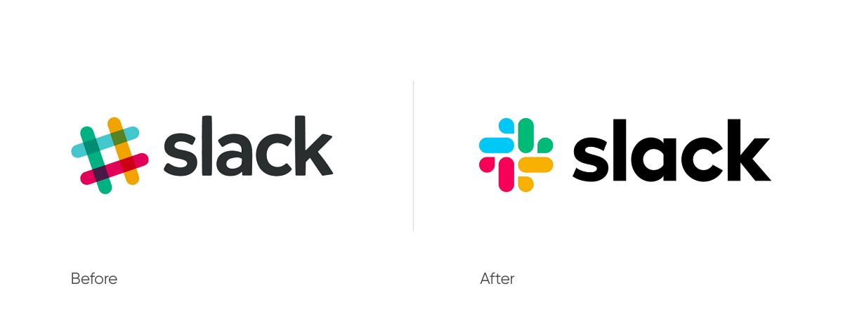
On Wednesday Slack introduced their new brand to the world wide web, announcing ‘Our in-house design and brand team, together with Michael Bierut and the team from Pentagram, worked to create a new and more cohesive visual identity.
What do we think?
There are already a lot of thoughts, opinions and feelings on the new logo. Some positive, plenty negative and of course an abundance of memes!
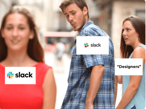
Image: Twitter
If you’re a brand as well-known as Slack all logo updates, no matter how small will initiate conversation from your community of users and that’s OK. Slack expected this and have clearly explained their rationale and a lot of us get it. Ultimately, the rebrand hasn’t disrupted the product itself, the new branding hasn’t impacted on the app’s usability or functionality and that’s what its users love it for.
We have been discussing the rebrand (naturally via Slack and face to face), what’s our overall opinion?
Effective brand evolution
It is by no means offensive, but it hasn’t wowed us either, the differences aren’t that radical on first glance. This is the right balance here in our view.
Getting rid of the # themed logo was brave.
The whole tech is built on hashtags. It feels like Apple getting rid of their Apple themed logo. We like the garland feel though and the linking / binding / bringing together flourishes work well – especially if Slack want to move out of the tech-tool it is and into the general messaging world, ala WhatsApp.
We like the refinements to the colour palette
This alone will make marketing the brand much simpler because let’s face it – with 11 different colours, it would have been easy to make a hash of the old logo!
Slack have alluded to this on their blog. ‘It’s an evolution, and one that can scale easily, and work better, in many more places.’
So, good or bad?
Overall, we like it, it’s a positive brand evolution. And brand shifting is so easy to get wrong. We actually think Slack have done it well.
What do you think of the rebrand? Follow us on social and let us know!
Follow Zesty on Facebook, twitter or LinkedIn.
*An octothorpe is another name for a hashtag (#) symbol.
You can keep an eye on the conversation via the hashtag #Slack